The smallest SVG possible
svgminimaltipsHow would you make my site favicon from a bitmap into an SVG? (don’t cheat with web inspector)
The lazy me would just software trace using my favourite illustration tool. (Inkscape)
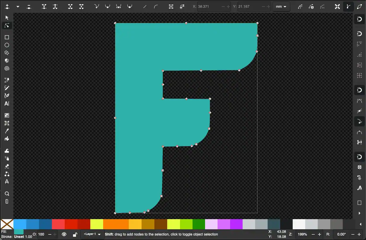
But yuck, look at those node coordinates, and the shape is kind of melted when you look up close.
In better news, the resulting filesize is an affordable 2kb, much smaller than a decent resolution png or jpeg – but files over two thousand bytes are rookie numbers!
We're a long way from optimal SVG sizes.
So maybe we should roll up our sleeves and manually redraw it with the pen tool — being careful about where to place nodes, and when to use straight lines vs beziers.
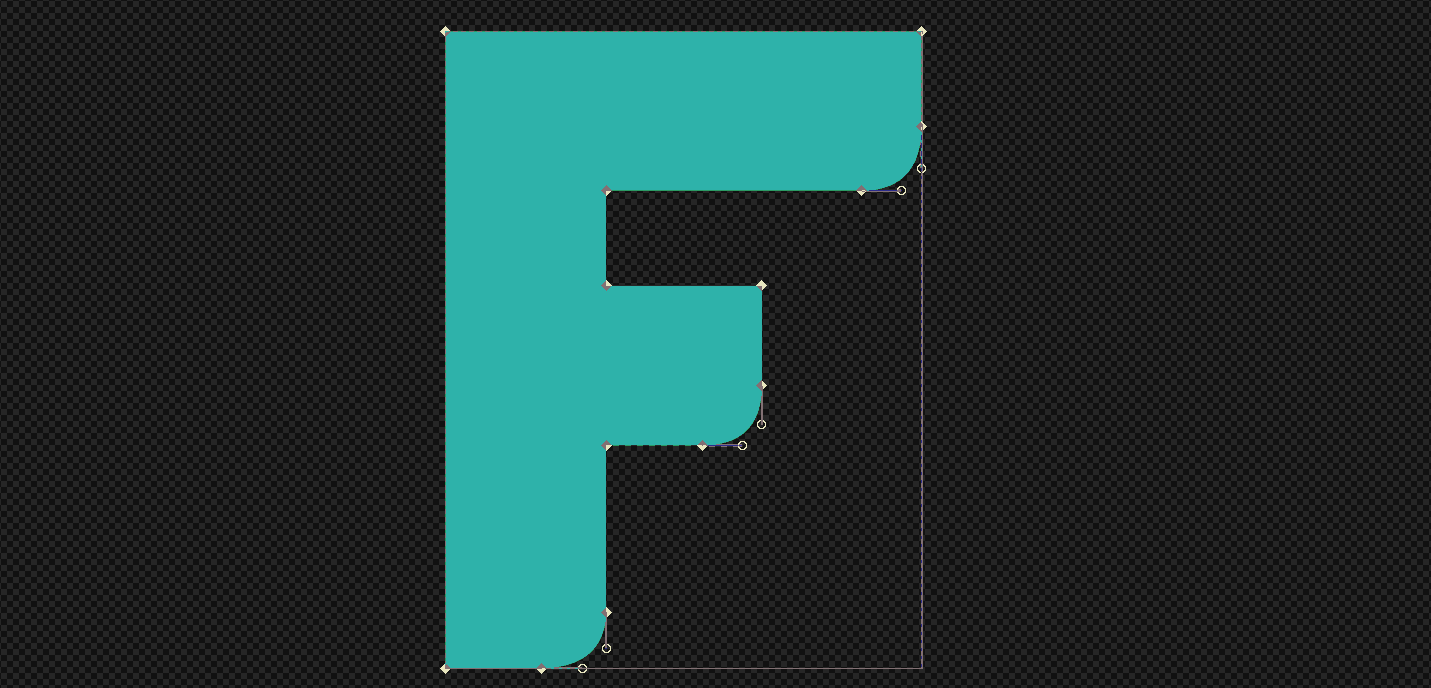
Woohoo we're now at 800 bytes - less than half the original size.
At this point, I'd urge you to go one step further and optimise with SVGO or manually with SVGOMG — being sure not to melt the shape with precision settings.
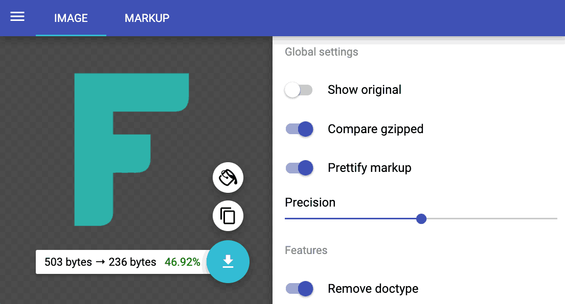
Wow, that worked great — We're now at around 236 bytes which is excellent. The shape is even closer to the original than tracing. This is usually as good as it gets, an 88% reduction from automatic tracing. IMO this was worth the effort.
What if we went deeper? #
I managed to get the image down to 127 bytes, 46% smaller than our best 236 byte image. All with full-fidelity by using a stroke-linecap:round hack.
Here's the full SVG:
<svg
viewBox=".5 .5 3 4"
fill="none"
stroke="#20b2a"
stroke-linecap="round">
<path d="
M1 4h-.001
V1h2v.001
M1 2.6
h1v.001"/>
</svg>
First I stroke the lines so I save on doubling coordnates, then I exploit the vand h relative operators at tiny offsets.
See the values with h.001 and v.001 and h-.001 ?
That's how I hacked the directional rounded corners.
Normally stroke-linecap:round is just round. Nothing you can do about it.
But when you change direction REALLY close to the edge coordinate, the cusp squares off on one side only, and you can control which side with negative or positive relative values.
Neat huh? We're just getting started...
The Outfit logo #
A while back, I created this interactive demo of the Outfit logo to teach some of the fundamentals of plotting and styling SVG path coordinates. There's no fill here.
See the Pen Outfit Logo Inspector by Andy Fitzsimon (@andyfitz) on CodePen.
History of the mark #
Rowan Hogan originally designed the Outfit logo. No doubt without regard specifically for SVG format optimisation. Don’t let the medium become the message as they say.
The design evolved with minor optical updates and when it came time to make this demo, it had optimisation amenities stacked against it:
- An optical overshoot (round coords non-exact to a grid)
- Non-perfect curves (the f and the u are bent differently)
- Non 1:1 grid rhythm (1:1.3 spacing of stems)
Thankfully the solution above is full-fidelity to the intended mark.
It got even smaller as a one-liner: 253 bytes, styled and uncompressed (not bad for so many letters)
<svg viewBox="0 0 19 8.5"
stroke="#e40046" fill="none">
<circle cx="2.36" cy="6.12" r="1.68"/>
<path d="M5.35 4
v2.5A1.02 1 0 008 6.5v-2h10.68
M10.2 8.2v-6
m2.3 6V2a1.3 1.2 10 012-1
m.3 7.2V4.5
m2.3 3.7v-6"/>
<path d="M14.8 2.8v0"
stroke-linecap="round"/>
</svg>
Rules to SVG by #
This list is by no means comperehensive but it does serve as a rough guide
Small Artboards #
Ensure coodinate precision by keeping your viewBox under 10 or 100 - from zero
<svg viewBox="0 0 10 10" ... > It makes sense to factor up by 10 for more intricate shapes.
<svg viewBox="0 0 100 100" ... >
Both scales work depending on the complexity of your image. The point here is we dont want every coordinate to be in the thousands, we also want to avoid unnessecary decimal coordinates. Every byte counts.
If every coordinate has a decimal place, go up by 10. If only a few do, try to round up.
Stroke if you can #
Every shape you can pull off as a stroke that would otherwise be a filled path saves you 2-3x bloat in coordinate. This is fairly easy to visualise as a stroke only has an inner line that can be expanded wheras a filled shape has two outer lines to create a zone.
When you combine the right sized viewBox and stroked path, you wont even have to set stroke-width as it defaults to 1 viewBox unit.
Know when to capital or lowercase path coordinates #
Don't know the difference?
Uppercase Letters like M C L A H V Q T etc all start an operation relative to the viewBox
Lowercase letters (same as above) m c l a h v q t etc start from the last coordinate you did
Relative or absolute positioned coordinates make a huge difference. Sometimes optimisation tools like SVGO can select which one is best, but not always.
Chose your operator wisely #
Using a horizontal H or vertical V operator is great because you only need one coodinate it saves you tryping both X and Y, you only need one coordinate so that halves what would otherwise be redundant axis data with the line-to L operator.
Arc paths, quadratics and cubic splines all have their own benefits and problems.
Dirty Path Tricks #
Circle with single arc operators #
You can draw 'pretty much' a perfect circle with a single SVG path arc operator.
If you're already working in a path d="" element, there's no need for a new element.
This saves you 10 bytes per circle in that context. So we can do:
M5 0a5 5 0 10.001 0vs having to go create a new element which could get messy for your CSS
<circle cx="5" cy="5" r="5"/> Dots with stroke-linecap="round" #
if you're doing a line icon with linecap-round you can make a dot the exact width of your stroke just by doing a very short relative horizontal or vertical line
<path d="M 5 5 h.001" stroke-linecap="round"/>